Unifying O’Reilly’s Learning Platform & events Experience
HEAD OF MOBILE PRODUCT DESIGN
To unify O’Reilly’s learning platform and conferences, I led the UX strategy for merging our mobile experiences. Working cross-functionally with engineering, sales, and marketing, we designed a seamless, personalized app that increased user engagement and created new sponsorship revenue streams.

The Business Challenge: Bridging Two Disconnected Experiences
O’Reilly’s learning platform and conferences had historically operated as two separate entities, creating missed engagement and revenue opportunities:
Conference attendees were unaware of their complimentary trial access to the learning platform and weren’t activating their subscriptions.
Existing learning platform users weren’t registering for conferences, despite overlapping interests.
The conferences relied on a third-party app, which lacked deep integrations with O’Reilly’s learning resources, resulting in a fragmented experience.
GOALS
-
Increase subscription conversions and event attendance by unifying O’Reilly’s learning platform and conferences into a single mobile experience.
-
Create a seamless cross-platform experience where users can discover, register for, and engage with both on-demand learning and live events in one place.
-
Strengthen O’Reilly’s position in the tech education space by driving deeper user engagement and enhancing business partnerships through integrated learning and networking.
My Leadership Strategy: Aligning Cross-Functional Teams & Defining the UX Approach
User Research & Personalization Strategy:
Mapped out 10 key user types
By analyzing engagement patterns across O’Reilly’s learning platform and conferences, ensuring the unified experience accounted for unique conference and platform engagement histories.
Defined tailored onboarding flows
To seamlessly introduce users to the unified platform based on whether a user was new to the platform, a past conference attendee, or an active subscriber.
Leveraged behavioral data
To create personalized content recommendations, improving engagement with both learning materials and live events.
Cross-Functional Leadership:
Collaborated with engineering teams
Across mobile, backend, and events to merge disparate user bases into a unified authentication system.
Built cross-team relationships
Working closely with the Senior VP of Conferences, VP of Sales, and Director of Marketing to define the value proposition and MVP scope.
Established Clear communication
Through leading biweekly strategy meetings with executives and product teams to align priorities, resolve backend constraints, and define rollout phases.
Execution: Tackling UX Complexity & Phased Rollouts
Given the scale and complexity of this initiative, we implemented a phased approach to ensure seamless integration while adapting to evolving stakeholder priorities.
Simultaneously, engineering teams worked on merging our user bases into a single authentication system—a massive backend lift that delayed key features, requiring UX adaptation to accommodate staged releases.
-
Phase 1: MVP Integration
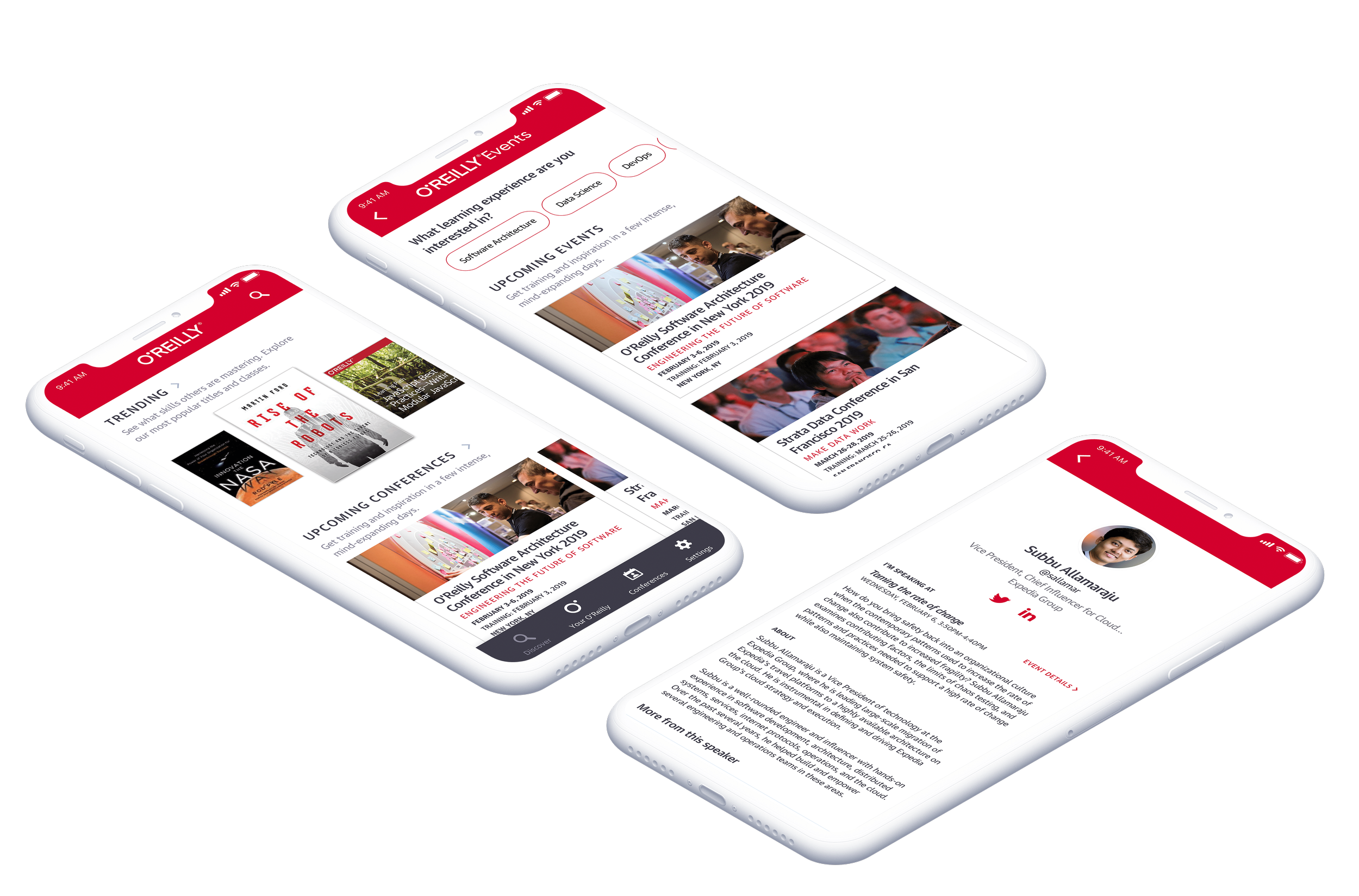
Integrated conference discovery into the existing mobile app, allowing platform users to explore upcoming events.
Unified sign-in experience, setting the foundation for personalized recommendations.
-
Phase 2: Enhancing the Conference Experience
Introduced conference schedules, speaker profiles, and sponsor pages to establish the app as a guidance tool for attendees.
Conducted on-site usability testing at O’Reilly’s Artificial Intelligence conference in NYC, refining features based on live attendee feedback.
-
Phase 3: Personalization & Custom Schedules
Launched the "Your O’Reilly" dashboard, providing users with a centralized hub for:
• Books & videos they had started
• Trainings they were taking
• Conferences they were attendingEnabled personalized conference schedules, allowing attendees to plan their sessions and sync them across devices.
-
Phase 4: Sponsorship & Engagement Tools
Designed new revenue-driving features, including sponsor meeting requests & exhibitor demos to enhance business networking.
Developed a messaging & notification system to connect attendees, speakers, and sponsors.
Phase 1: MVP
Fragmented User Journeys
Disconnected learning and event experiences created engagement drop-offs, with conference attendees unaware of their included learning subscriptions and platform users missing relevant event opportunities. Without a unified experience, users had to navigate separate apps, reducing overall retention and cross-platform engagement.
Solution
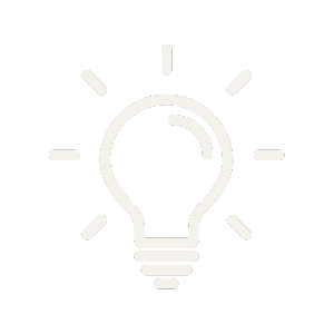
Mapped out 10 key user types & scenarios and designed personalized onboarding flows to seamlessly integrate both learning and event content based on user history.
Discovery work:
Mapping out the current events app flow and user journey for event registration and attendance.
Identifying proposed integration strategies for unifying the learning platform & conferences experience.
Technical and process considerations.
Click each image to expand.
User type and scenario mapping
iOS unified app MVP
Phase 2: New Conference Features
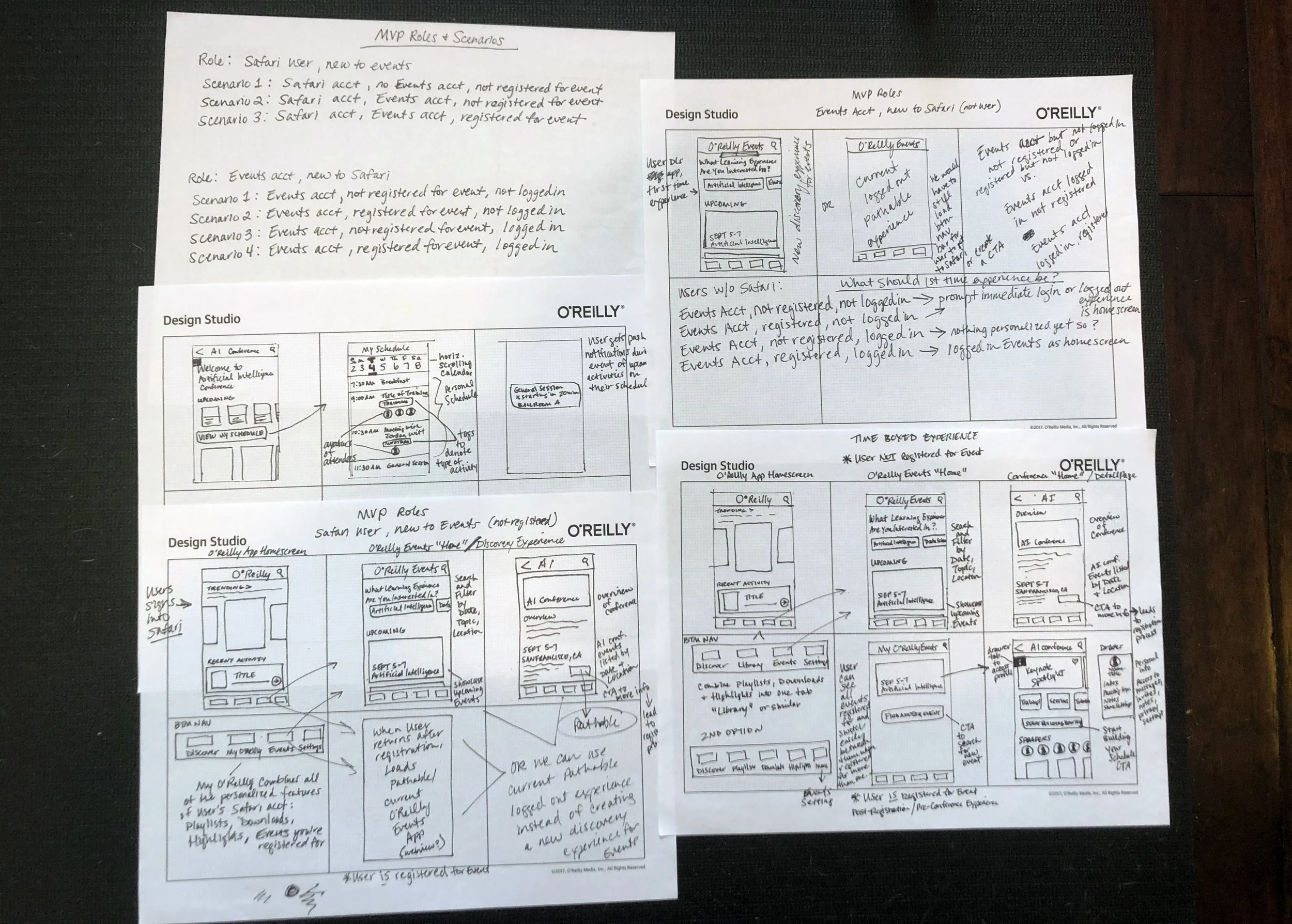
In the next release, we introduced conference schedules and speaker & sponsor screens, laying the foundation for the app to serve as a real-time guidance tool for event attendees.
In Fall 2019, my product manager and I traveled to O’Reilly’s Artificial Intelligence Conference in New York City to beta test the app with live attendees. At one point, I worked directly with engineers on-site, making real-time adjustments mid-conference to refine the experience based on immediate user feedback.
Real-Time User Feedback
Sketching ideas for a conference scheduling feature.
Click image to expand.
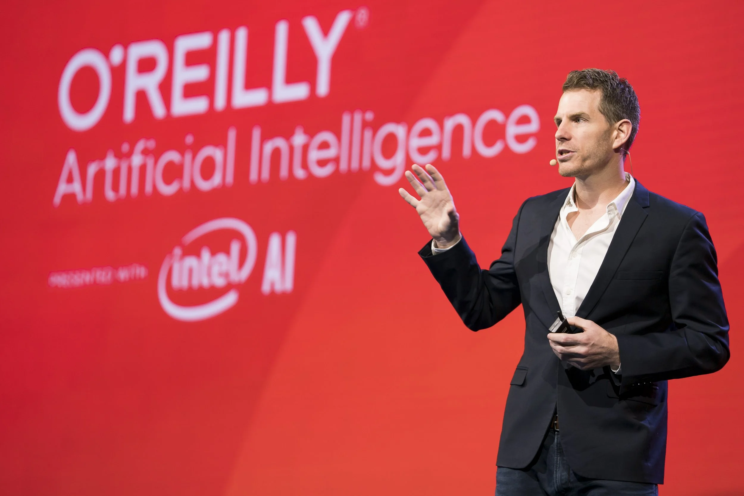
We conducted a beta test of the apps with live attendees at O’Reilly’s AI conference in NYC.
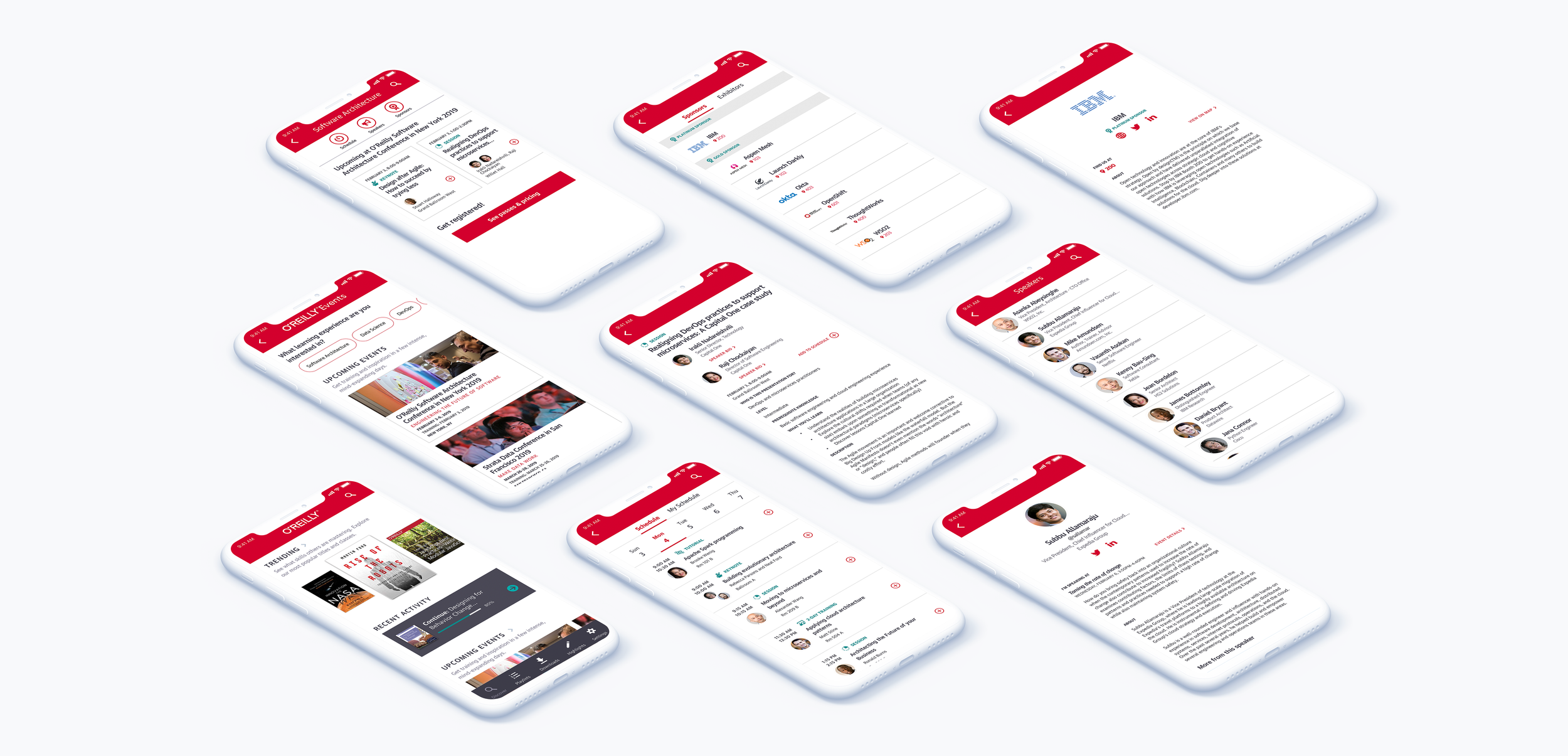
Sample screens of the iOS beta version we tested
Phase 3: personalization
curated Content Discovery
Users struggled to find relevant events and learning materials, often missing out on valuable opportunities due to siloed content and lack of tailored recommendations. A central hub was needed to surface personalized suggestions based on user behavior, learning history, and upcoming events.
Solution
Designed "Your O’Reilly" as the central hub for the new unified app, providing users with a personalized dashboard that seamlessly integrated on-demand courses, live training sessions, and upcoming conference events. This dynamic home screen used behavior-based recommendations to surface relevant learning materials and events, ensuring users could quickly resume content and explore the newest platform offerings.
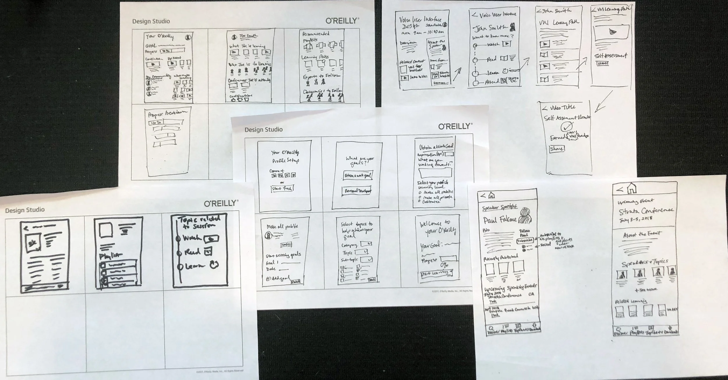
Sketching ideas for the new Your O’Reilly concept
Wireframes
I created low-fidelity wireframes to explore multiple layout variations for the new Your O’Reilly personalized dashboard, event discovery, and content recommendations. To validate our approach, I conducted usability testing with internal stakeholders and key user segments, refining navigation patterns, menu structures, and onboarding flows based on feedback. This iterative process ensured the information architecture was intuitive, reducing friction between learning and event engagement.

Wireframes for the unified O’Reilly Android app
User testing
To validate the effectiveness of Your O’Reilly as the central hub for personalized learning and event discovery, I conducted user testing sessions with a diverse group of platform subscribers, conference attendees, and new users. The goal was to assess how easily users could navigate between on-demand courses, live training sessions, and upcoming events. Through task-based usability testing, we identified key refinements, such as improving content hierarchy, simplifying filters, and enhancing recommendation clarity. These insights directly influenced final design adjustments, ensuring Your O’Reilly provided a seamless, intuitive experience tailored to each user’s needs.
Your O’Reilly user testing synthesis.
Click image to expand.
Research synthesis summary.
Click image to expand.
I developed a new research approach instead of traditional synthesis methods after noticing insightful patterns during early analysis. Standard research often anonymizes data, stripping away user context—an issue when testing personalization and customization experiences. By preserving user identities, I observed that roles heavily influenced behavior; for example, engineers and data scientists approached the app with a systems-thinking mindset, while teachers and behavioral specialists prioritized collaboration and progress tracking. This method not only retained personas and user intent but also connected pain points to their underlying “whys,” making affinity diagramming more effective and reducing bias in findings.
There were two overarching insights into what users feel they want and need to learn successfully:
A sense of community
A platform that learns and adjusts to their learning habits.
The old conference app used a third-party design system, resulting in inconsistencies that clashed with O’Reilly’s learning platform. Colors, typography, and UI components varied across experiences, leading to a disjointed visual identity that impacted user trust and engagement.
Brand & Visual Cohesion
Led a visual design refresh to align the conference experience with O’Reilly’s brand, updating color palettes, typography, and UI components for consistency. This ensured a unified look and feel across both learning and event experiences, reinforcing O’Reilly’s identity while improving usability and accessibility.
Solution
Before, conferences used Pathable, a third -party app resulting in a disconnected experience.
Click image to expand.
Brand color palette from O’Reilly’s brand guidelines.
Click image to expand.
Defining icons for native mobile use.
Click image to expand.
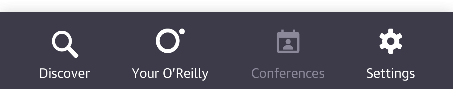
Adding the new “Your O’Reilly” and our branded “O Dot” icon to the nav bar in the apps.

“Over time, through consistently appropriate use, the O Dot has the power to announce who we are and how we see things differently without saying a word—it’s our very own Nike Swoosh”
iOS visual design exploration.
Click image to expand.
Android visual design exploration.
Click image to expand.
Technical Constraints
Merging user accounts from two separate systems created authentication challenges, requiring a seamless way to unify access without disrupting existing users.
Solution
Created scenario maps and flow diagrams to define key authentication points across the unified app, ensuring a seamless transition between learning and event content. These diagrams helped engineering teams streamline user authentication, accommodating new subscribers, returning conference attendees, and existing platform users without disrupting access.
iOS
All scenario diagrams for iOS.
Click image to expand.
Sample iOS scenario for an authenticated user with usage history that has attended a past conference.
Click image to expand.
Android
All scenario diagrams for Android.
Click image to expand.
Sample Android scenario for an authenticated user with usage history that has attended a past conference.
Click image to expand.
Your O’Reilly on a Samsung Galaxy S7 Edge
Discover & Your O’Reilly screens on iOS
Phase 4: sponsorship & Messaging
Engagement Limitations
The existing app lacked features enabling direct interaction between attendees and sponsors, limiting opportunities for meaningful connections and business development.
Solution
Introduced the ability for users to request meetings or product demos directly within the app, increasing sponsor value and creating deeper attendee engagement.
Sponsor meetup request feature for iOS.
Click image to expand.
Communication Challenges
Without an integrated messaging or notification system, conference attendees, speakers, and sponsors struggled to connect effectively, resulting in missed opportunities for interaction and collaboration.
Solution
Designed an integrated messaging and personalized notification system, leveraging unified authentication to deliver timely, relevant updates tailored to individual users’ conference activities and interests.
Android messaging and notifications system.
Click image to expand.
Business & Team Impact: Strengthening O’Reilly’s Unified Learning Ecosystem
By merging O’Reilly’s learning platform and conference experiences into a single, cohesive mobile app, we transformed how users engage with educational content and events, creating new opportunities for user growth and revenue.
key outcomes
Successfully established unified authentication and personalized content recommendations, significantly improving user satisfaction and streamlining access across O’Reilly’s product offerings.
Improved cross-platform engagement, enabling users to seamlessly explore and participate in both online learning and live conferences.
Laid a scalable foundation for personalized experiences, allowing future enhancements in content discovery and user retention.
Enhanced collaboration across UX, engineering, marketing, and events teams, fostering a unified approach to product development and strategic execution.
Subscription activations
increased by 15%
among event attendees,
expanding O’Reilly’s
recurring revenue potential
my leadership impact
Led UX strategy and
alignment across
4 cross-functional teams
Product, Engineering,
Marketing, & Events
Increased subscription activation
by 15% among event attendees,
directly contributing
to O’Reilly’s recurring
revenue goals
Improved attendee
interaction by
integrating in-app
sponsor demos
and meeting requests,
creating new business
opportunities and
higher conference participation.
Conducted live,
on-site beta tests at
O’Reilly’s AI Conference,
enabling immediate
design refinements
based on direct user insights.
Successfully rolled out
multiple app releases
over 12 months,
iteratively enhancing
user experience
Launched the personalized
Your O’Reilly dashboard,
boosting user engagement
through tailored
content recommendations
and simplified navigation.
Facilitated seamless
user transitions
between content and events by
streamlining
unified authentication,
enhancing both security
and user experience.
Unified and refreshed
the visual identity
across both learning and
event features, creating a
cohesive, consistent
user experience
aligned with
O’Reilly’s brand vision.
Leadership Reflections
Merging O’Reilly’s learning platform and conference experience into a single app required deep collaboration across product, engineering, marketing, and leadership teams. With two previously separate platforms, our challenge was not just technical—it was about creating a seamless user experience while balancing stakeholder priorities.
KEY leadership TAKEAWAYS
Cross-functional alignment ensures clarity. Worked closely with PMs, engineers, and stakeholders to define a unified product vision, we ensured the new app met both business and user needs.
Scenario mapping drives smarter design decisions. By collaborating with engineering and data teams, we mapped out 10+ unique user journeys to personalize onboarding and content discovery.
Iterative collaboration fuels long-term success. The engineering team was involved from wireframes to final design handoff, allowing for continuous feedback loops and technical feasibility checks throughout the process.
This project reinforced that large-scale platform unification isn’t just about merging features—it’s about bringing teams together to build a cohesive, user-first experience.